The Benefit of Salesforce Dashboards
Salesforce dashboards are a data visualization tool that displays real-time metrics and executive KPIs for a company. They’re implemented company-wide, displaying data from your Sales Cycle, Marketing Campaigns, CSAT scores, and much more. Dashboards are crucial for a company to grow and succeed as they give real-time insight into how your departments are performing, aligning some departments along the way (e.g. Sales and Marketing).
Great dashboards take time and patience to perfect as they require collaboration within your company. At the end of the day, you’ll want your entire company to love these dashboards so much that they keep them open all the time. This post contains dashboard characteristics that will guide you towards doing just that.
1) Departmental Dashboards
These types of dashboards consistently remind your departments of their performance, allowing for adjustments to be made wherever necessary. You may be thinking of Sales and Marketing at this moment, but don’t forget dashboards for your Administration, Accounting, Production and other departments too!
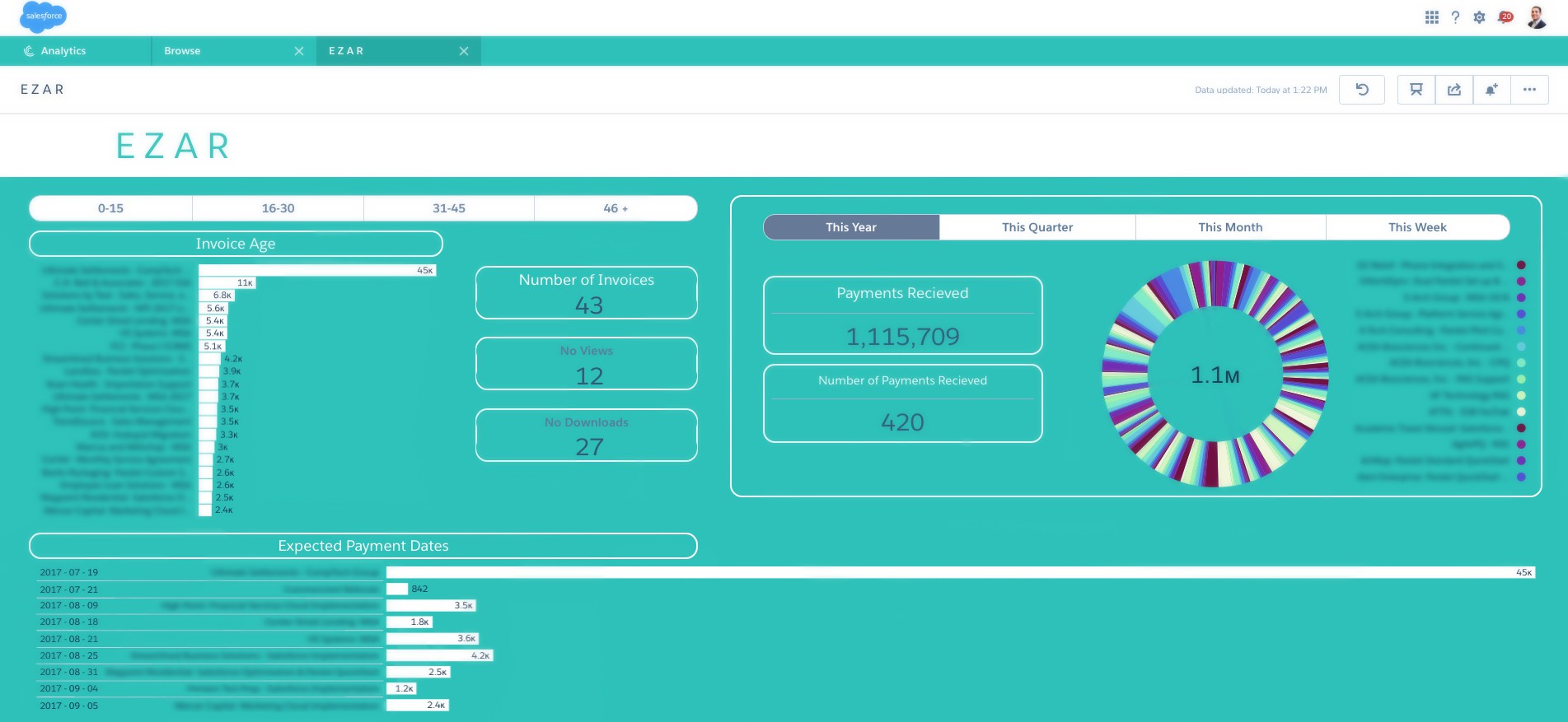
For example, our Accounting Dashboard tracks and displays outstanding invoices by their age, amount, and expected payment date. We utilize a fully automated AR solution, EZ-AR™ to automatically follow up and collect expected payment dates and actual payments until they are received.
2) Aligned Dashboards
In addition to their individual dashboards, you should have one single dashboard for Sales and Marketing specifically for tracking revenue. It will keep them both aligned and should be reviewed on a weekly basis with everyone in those departments. Add key metrics to have insight into those opportunities that were driven by marketing campaigns to see which ones are working, and which ones need optimization. With everyone looking at the same dashboard, they are more prepared when entering a meeting.
In Account-Based Marketing (ABM), alignment is everything! So much that “70% of ABM users report that their sales and marketing organizations are mostly or completely aligned, compared to 51% for non-ABM users” – ABM adoption report, Sep. 2015. Whether your team utilizes ABM or not, dashboards are a stepping stone in completely aligning your teams.
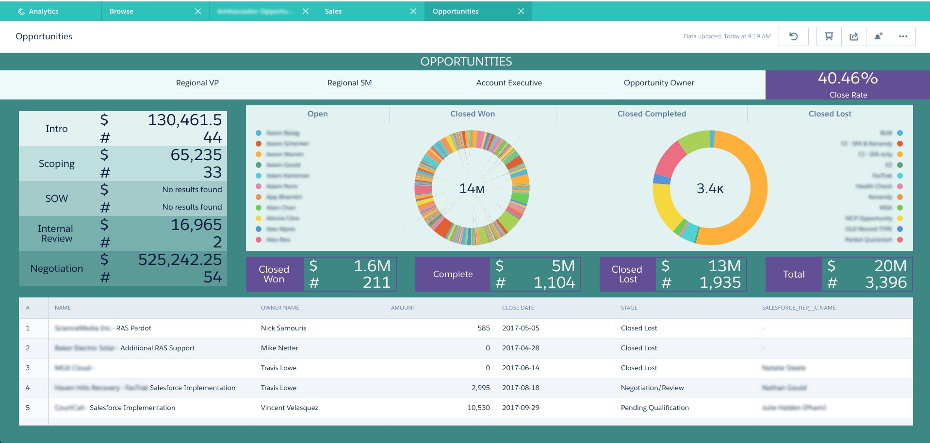
3) Sales Cycle Dashboards
Take the stages in your Sales cycle and track them through a dashboard. There are multiple ways you can display this information; by each stage, you can populate it with the opportunity’s amount, the number of leads/contacts, and even the number of opportunities. Then display metrics for opportunities or leads/contacts that were closed-won, completed, closed-lost, etc.
Go even further with an advanced reporting analytics solution such as Salesforce’s Einstein Analytics to drill down into these metrics. Drilling down saves you time and provides you with additional insight into the progress throughout each step of your sales cycle. It allows you to be proactive instead of reactive.
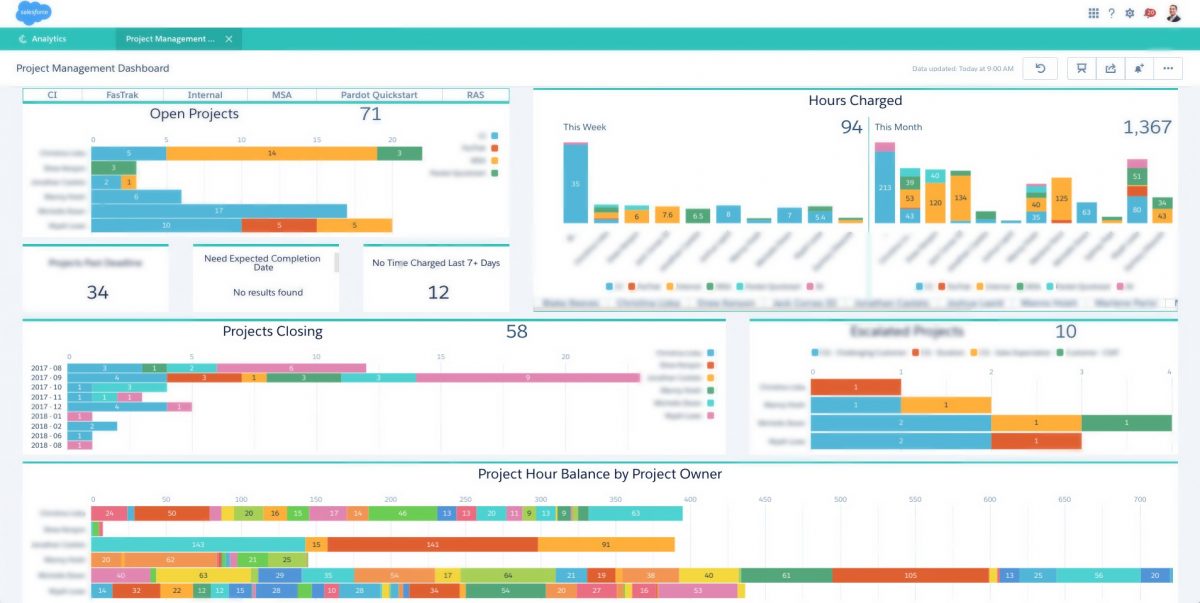
4) Task Management Dashboard
These types of productivity dashboards give you insight into any open or closed tasks by project, project owner, etc. Rather than going through open projects one-by-one to view the tasks associated with it, have a dashboard that visually lays out all the projects assigned to a user, with the perspective tasks underneath each one. This dashboard keeps your project managers extremely prepared, and usually turns into their new best friend.

5) Dashboard Optimization
Your newly created dashboards won’t be perfect when you first roll them out, they never are. Work with your team to receive feedback and optimize their dashboards. This process will be ongoing as dashboards are a continuously growing platform, with new reports to add and adjust. More feedback from your team means they are consistently using them!
After deploying your dashboards, these updates are usually minor tweaks that take a few minutes. The Salesforce platform has easy to create dashboards where you can quickly drag and drop reports around to best fit the viewer. You’re also able to add visual components to each report, displaying them in tables, pie charts, funnel charts and much more.
6) Make it enjoyable
No one wants their new, exciting dashboards to look like replicas of what they were using in spreadsheets. If you really want your team to use these dashboards, you need to add some design to it. Aesthetically pleasing dashboards will see a higher use rate and get your team excited about reporting. Add some color, and we recommend using graphs, pie charts, and more when utilizing dashboards.
The bottom line is, the more your teams uses Salesforce dashboards, the greater your ROI will be.
If you’d like to learn more about how dashboards can benefit your company, please contact us below:
Hi Jack,
Is there any license is required to use Analytical Dashboard in Lightning Component. for Analytical Web SDK
Thanks,
Ranjith
Hi Ranjith,
If you have a Salesforce Einstein License, you should be able to use the Analytical Dashboard in Lightning Component once it is enabled.